# 说明
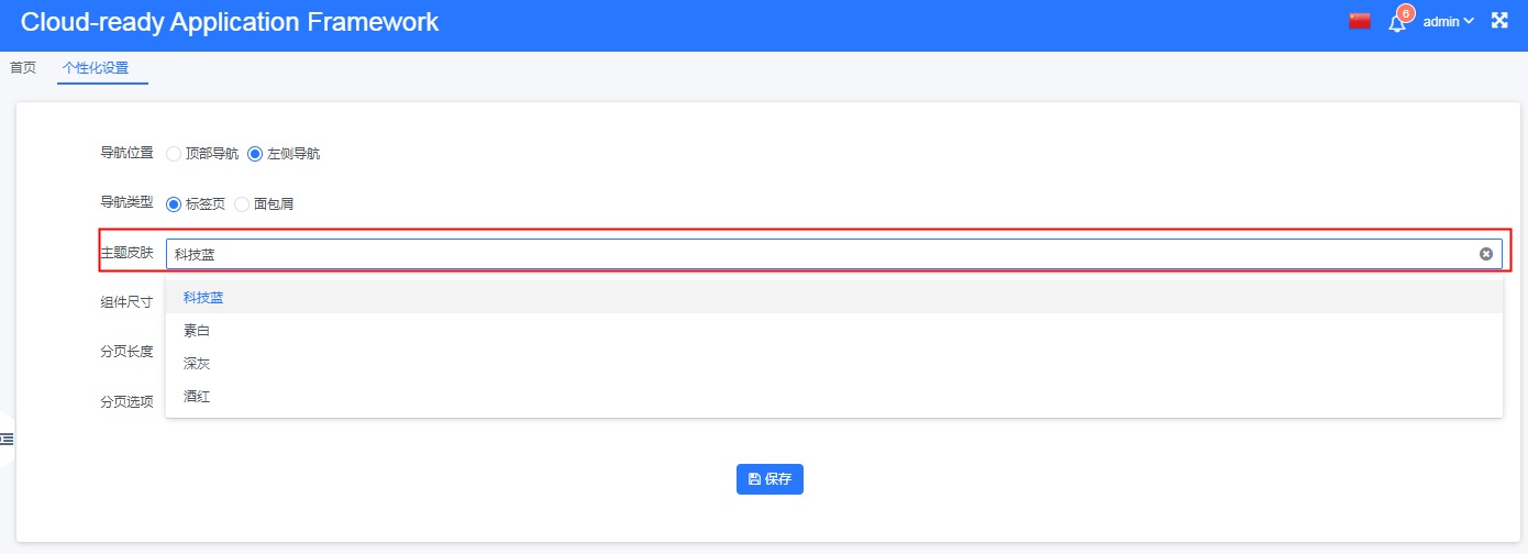
前端基于less预编译技术,通过修改关键样式(颜色,大小等)变量值的方式,较为便捷地实现了主题定制功能,同时支持在线切换应用主题样式。
# 代码组织
- 📁 src
- 📁 common
- 📁 styles
- 📄 var.less // 全局样式变量表
- 📄 common.less // 公共样式,用于配置式视图和自定义视图
- 📄 smarter.less // 公共资源入口
- 📁 components // 框架组件跟随主题变化的样式,不变的部分在组件的定义中
- 📁 pages // 页面跟随主题变化的样式,不变的部分在页面的定义中
- 📁 theme // 主题定义
- 📁 default // 默认主题定义
- 📄 index.less // 主题入口文件
- 📄 style-fix.less // 主题对公共资源的重新定义
- 📄 var.less // 主题对全局样式变量的重新定义
- 📁 grey // 深色主题定义
- 📁 purple // 紫色主题定义
- 📁 white // 浅色主题定义
# 默认主题实现
# 主题入口文件
// src/common/styles/theme/default/index.less

@import '../../smarter.less'; // 引入公共资源定义
@import './style-fix.less'; // 引入主题对公共样式的修改
@import './var.less'; // 主题对默认样式变量的重定义
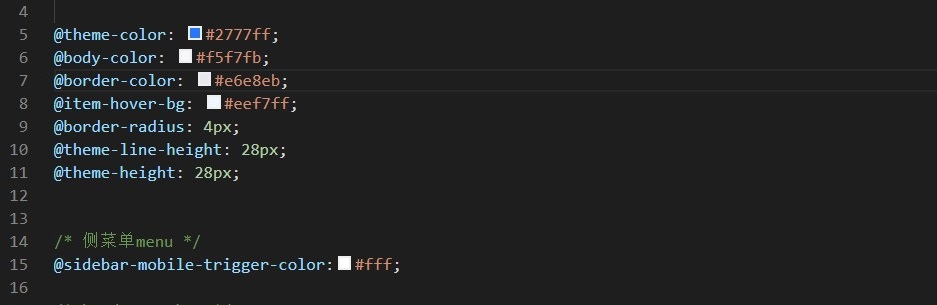
# 主题样式变量重定义
// 以下变量是默认主题中对颜色、大小等重要因素的设定,不同主题的实现,就是给这些变量赋不同的值

@theme-color: #2777ff;
@body-color: #f5f7fb;
@border-color: #e6e8eb;
@item-hover-bg: #eef7ff;
@border-radius: 4px;
@theme-line-height: 28px;
@theme-height: 28px;
/* 侧菜单menu */
@sidebar-mobile-trigger-color:#fff;
/* header-navbar */
@header-bg: @theme-color;
@header-color: #b7d1ff;
@header-color-active: #fff;
@header-info-color: #b7d1ff;
@header-height: 54px;
@header-line-height: 54px;
@sidebar-border-width:0px;
# 公共样式
/src/common/styles/common.less 中定义了若干常用的,可在公共组件、自定义页面、自定义视图中引用的样式,因内容过长,详细定义请参阅文件内容。
# 公共组件、业务组件/视图、自定义页面的主题化
这三种情形,实质都是自定义Vue组件,其样式实现建议分两部分:
- 不随主题变化的样式,就近写在 Vue 文件里面
- 随主题变化的少数样式,写在
/src/common/styles/components或/src/common/styles/pages下
新增主题 →